With the NativeScript 6.0 release we announced a new beta of the NativeScript core theme, which looks a little something like this.
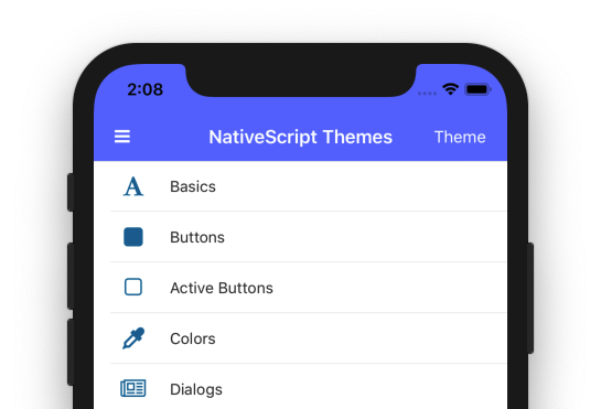
In this article we’ll take a deeper look at the new theme, including what changed, and how to try out the new theme for yourself today. Let’s start by looking at how you can get up and running.
The new NativeScript theme is already on npm as version 2.x, and you can change any existing app to use the new theme by running the tns plugin update command.
tns plugin update nativescript-theme-core
NOTE: Because the 2.0 theme is still in beta, all NativeScript app templates still use version 1.x of the theme by default. Therefore, if you start a new NativeScript app today you still need to run
tns plugin updateto try out the updated theme.
The NativeScript 2.0 theme leverages a number of global class names that we added in NativeScript 6.1. Therefore, if you’re using a version of NativeScript earlier than 6.1, you’ll also need to add the following line of code to your app, which takes care of adding the appropriate class names manually.
import "nativescript-theme-core";
NOTE: Add the above code to your
app.jsorapp.tsfile if you’re using NativeScript Core or NativeScript-Vue apps, and yourmain.tsfile if you’re using NativeScript Angular.
Here are the list of class names that are now globally available for your app. The theme utilizes these class names for styling purposes, and you might also find these class names useful for your own custom styling.
ns-rootns-ios: Present on iOS onlyns-android: Present on Android onlyns-phone: Present when your app runs on phones (and not tablets).ns-tablet: Present when your app runs on tablets (and not phones).ns-portrait: Present when your app runs in portrait mode.ns-landscape: Present when your app runs in landscape mode.TIP: There are also a number of new CSS variables that you can use in your custom CSS as well.
There’s one final change you have to make to finish updating to the new theme. To make that change, open your app.css file and find your current theme import, which will look something like this.
@import '~nativescript-theme-core/css/<skin-name>.css';
Replace that line of code with the following imports.
@import "~nativescript-theme-core/css/core.css";
@import "~nativescript-theme-core/css/blue.css";
NOTE: If you use SASS, your imports will instead be
@import "~nativescript-theme-core/core";and@import "~nativescript-theme-core/blue";.
The second file (e.g. blue.css) determines your app’s color scheme. You must include a color scheme in order for the theme to work correctly, and you can choose between the following options: aqua.css, blue.css, brown.css, forest.css, grey.css, lemon.css, lime.css, orange.css, purple.css, ruby.css, or sky.css.
If you’re looking for a way to quickly experiment with your color options, the NativeScript theme’s GitHub repo contains a demo app that makes it easy to test out your choices. You can download and run this demo by executing the following commands in your terminal or command prompt.
git clone https://github.com/NativeScript/theme.git

cd theme

tns run android

-- or --

tns run ios
When the app is up and running, tap the “Theme” button in the top-right corner to experiment with different looks.
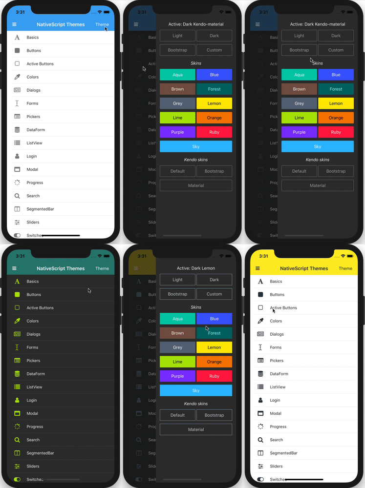
NOTE: We’ll look at how to enable the material theme and dark mode you see in the gif above momentarily.
With these steps complete you should now have the new theme up and running, so let’s next look at the changes and new features you can try out.
TIP: You can also try the new theme in NativeScript Playground. Use these examples as a starting point, as they already have the new theme installed and ready to go.
There’s one big update to the way the new core theme works, and I think it’s easiest to understand by looking at a bit of code first.
<!-- Before -->
<Button text="My Button" class="btn"></Button>

<!-- After -->
<Button text="My Button"></Button>
Before, the NativeScript theme required you to explicitly provide a class name to enable the theme styling, for example the btn class name for <Button> components.
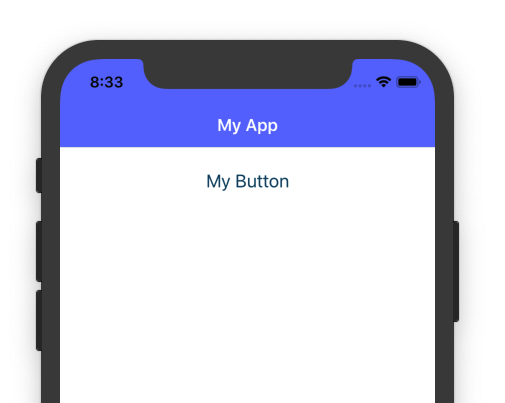
This is no longer necessary, and all NativeScript components get a base set of styles without any class names at all. For example, here’s what the default button looks like in a NativeScript app using the new theme and the blue color scheme.

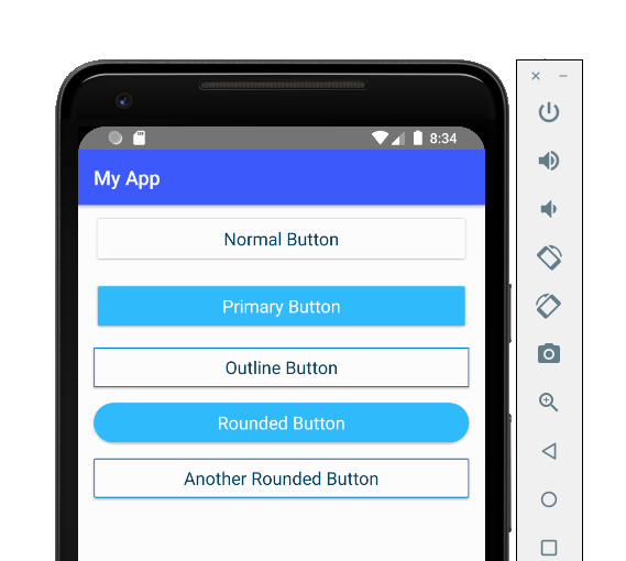
A number of the other theme class names have been shortened to make them easier to use. For example, here’s a before and after of how to use the various NativeScript button class names.
<!-- Before -->
<Button text="Normal Button" class="btn"></Button>
<Button text="Primary Button" class="btn btn-primary"></Button>
<Button text="Outline Button" class="btn btn-outline"></Button>
<Button text="Rounded Button" class="btn btn-primary btn-rounded-lg"></Button>
<Button text="Another Rounded Button" class="btn btn-outline btn-rounded-sm"></Button>

<!-- After -->
<Button text="Normal Button"></Button>
<Button text="Primary Button" class="-primary"></Button>
<Button text="Outline Button" class="-outline"></Button>
<Button text="Rounded Button" class="-primary -rounded-lg"></Button>
<Button text="Another Rounded Button" class="-outline -rounded-sm"></Button>
And here’s what those buttons look like in that same NativeScript app using the blue color scheme.
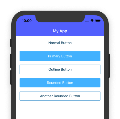
One super important note before we go further: the NativeScript 2.0 theme provides full backwards compatibility with the 1.0 theme class names through additional CSS files. Therefore, you can update to the new theme without having to change all the class names by adding the following imports to your app.css file.
@import "~nativescript-theme-core/core.compat";
@import "~nativescript-theme-core/<your-color-scheme-name>.compat";
For example a full app.css file for an app that uses the blue color scheme in compatability mode should look like this.
@import "~nativescript-theme-core/css/core.compat.css";
@import "~nativescript-theme-core/css/blue.compat.css";
And if you want both set of selectors to work simultaneously, e.g. you want both <Button class="-primary"> and <Button class="btn btn-primary"> to work, you’ll need to include both set of CSS files in your app.css, which looks like this.
@import "~nativescript-theme-core/css/core.css";
@import "~nativescript-theme-core/css/core.compat.css";
@import "~nativescript-theme-core/css/blue.css";
@import "~nativescript-theme-core/css/blue.compat.css";
The compatibility CSS files will help you get your apps converted, but to finish updating you’ll likely have a few additional CSS changes to make. For example, suppose you use this button in your app.
<Button text="Confirm your choice"></Button>
Because this button does not use the btn class name, it was not styled with the NativeScript 1.0 theme, but it will be styled as soon as you update to the NativeScript 2.0 theme; therefore, you might need to write some custom CSS to ensure these type of components continue to look correct in your updated app.
With this big change out of the way, let’s look at some of the cool new features the new theme offers.
Twitter has a dark mode, iOS is getting a dark mode, and now your NativeScript app can have a dark mode too. The new NativeScript theme has a built-in dark mode that works for all color schemes.
For example, here’s what our simple button app looks like with the new theme’s dark mode applied.
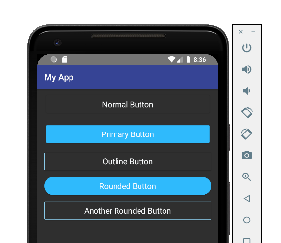
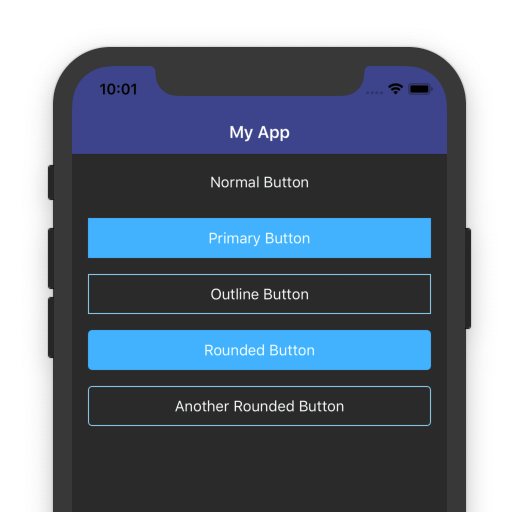
Enabling this dark mode is as easy as adding a ns-dark class name to the root element of your NativeScript app.
There are a few different elements that might be your root depending on how you built your app. For NativeScript-Angular apps your root element is usually your <page-router-outlet>, which usually lives in your app.component.html file.
<page-router-outlet class="ns-dark"></page-router-outlet>
If your app uses a drawer, your root element will likely be a <RadSideDrawer>.
<RadSideDrawer class="ns-dark">
    ...
</RadSideDrawer>
And finally, if your app does not use a drawer, and does not use Angular, you’ll likely need to apply the ns-dark class name to a <Frame>.
<Frame class="ns-dark"></Frame>
Regardless, once you apply the ns-dark class name your app should instantly change to display using a dark set of colors, regardless of the color scheme you’re using.
There is additionally a JavaScript / TypeScript API for programmatically switching your app from dark mode to light mode, in case you want to provide dark mode as an option for your users to toggle.
import Theme from "nativescript-theme-core";

Theme.setMode(Theme.Dark); // Or Theme.Light
Here’s what that API looks like in action in our sample app.
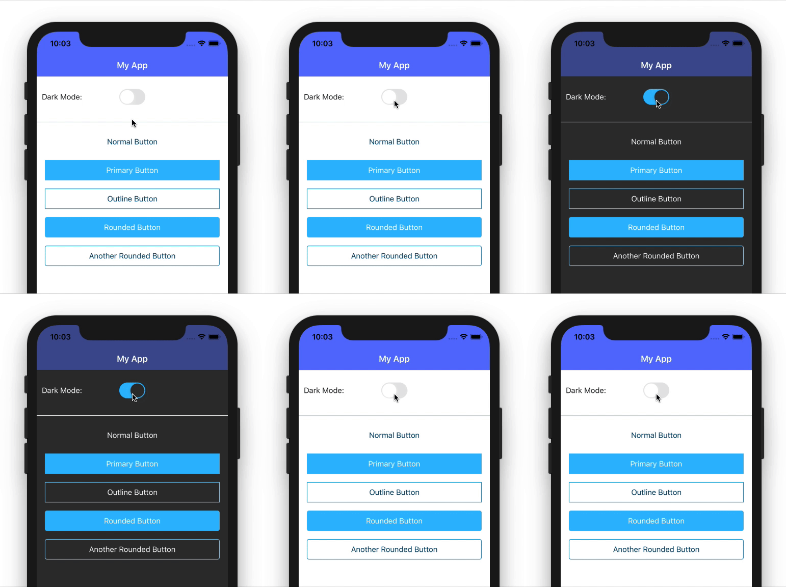
TIP: You can detect whether the user has dark mode enabled on their iOS device, and conditionally apply a dark mode in your app based on the user’s global iOS preference. Pretty cool, huh?
Now that you know how to use the new theme and how to try out dark mode, let’s look at one last cool feature of the new theme—the ability to use the Kendo UI ThemeBuilder.
Kendo UI ThemeBuilder is a tool for visually creating themes.
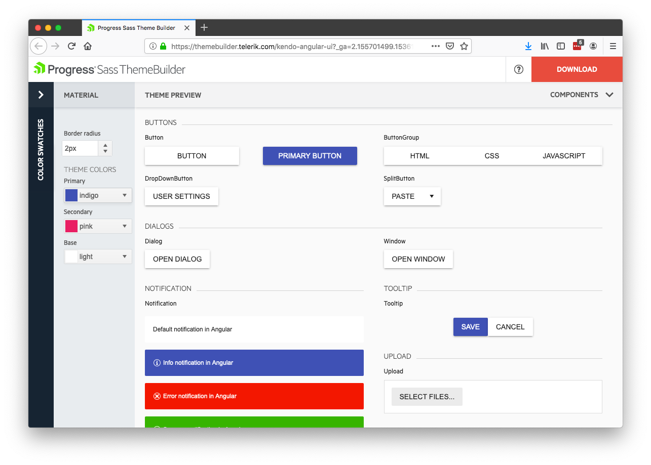
Historically the tool was used only for web apps, but now you can use the same tool to configure color schemes for your NativeScript apps as well.
To try it out, visit the tool, select Start Theming, select a base theme (Material is a good starting point for mobile apps), and click the Create button.
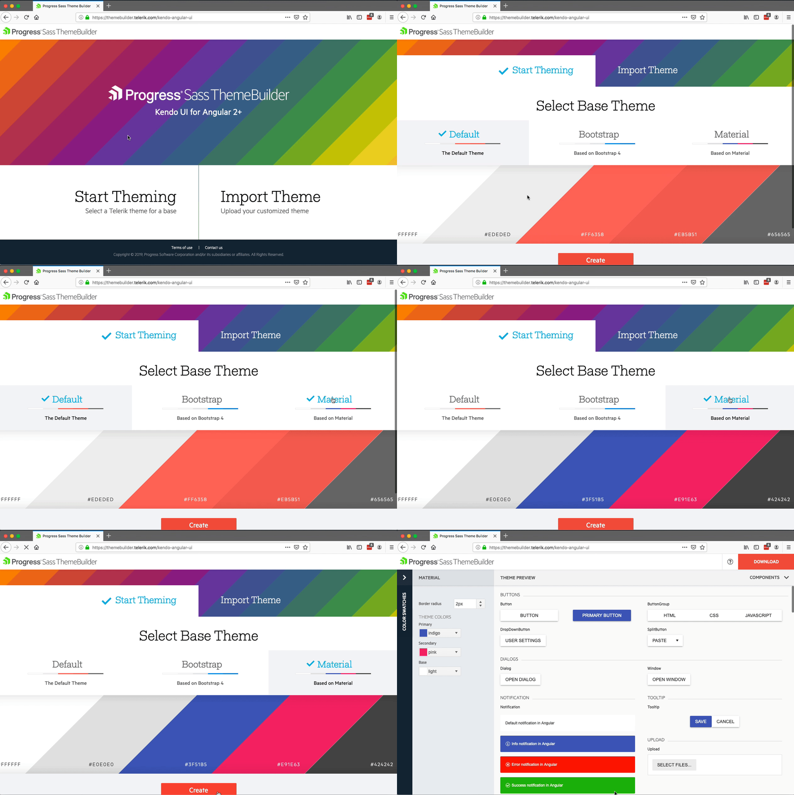
Feel free to play with the theme colors if you’d like, and then click the DOWNLOAD button in the top-right corner, which will give you a .zip bundle with two files, an app.css file you can use on the web if you’d like, and a variables.scss file you’ll need for using the color scheme with NativeScript.
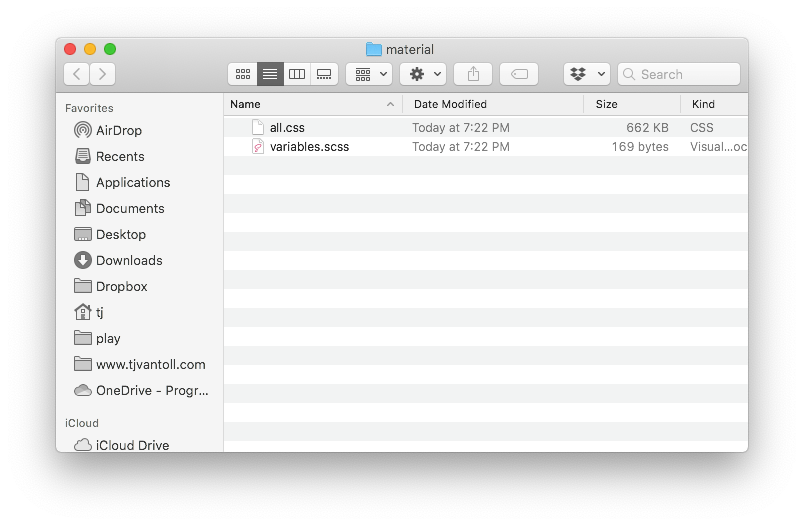
One important note before we continue: to use ThemeBuilder-built color schemes in NativeScript you must use SASS in your NativeScript apps, as ThemeBuilder outputs SASS variables, which the new NativeScript theme consumes.
The good news is that SASS is really easy to use in NativeScript. In fact, as of NativeScript 6.0, SASS support is built into all new apps by default, and all you need to do is create an app.scss file in the same folder as your app.css file to get started.
Once you’ve configured your theme in ThemeBuilder, downloaded the appropriate file, and created an app.scss file for your app, open your app.scss file and paste in the contents of your downloaded variables.scss file. Your app.scss file should look like this.
/* Contents of variables.scss */

@import "~nativescript-theme-core/index";

/* Your custom CSS */
For example here’s what the default Bootstrap theme looks like.
$base-theme:Bootstrap;
$skin-name:Bootstrap;
$swatch-name:Bootstrap;
$border-radius: 0.25rem;
$accent: #007bff;
$secondary: #e4e7eb;
$info: #17a2b8;
$success: #28a745;
$warning: #ffc107;
$error: #dc3545;
$body-bg: #ffffff;
$body-color: #292b2c;
$component-bg: #ffffff;
$component-color: #292b2c;
$card-cap-bg: #f7f7f9;
$card-cap-color: #292b2c;
$series-a: #0275d8;
$series-b: #5bc0de;
$series-c: #5cb85c;
$series-d: #f0ad4e;
$series-e: #e67d4a;
$series-f: #d9534f;

@import "~nativescript-theme-core/index";
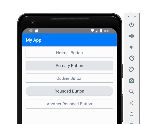
And... that’s it! Just by plugging in those variables you’ll have an app that uses your ThemeBuilder-configured theme. For example here’s what the ThemeBuilder Bootstrap color scheme looks like for our sample button app.

Feel free to experiment with Kendo UI ThemeBuilder to create the perfect theme for your own apps.
The new NativeScript theme provides a new look, as well as a number of new features you can leverage in your apps, such as a dark mode and the ability to use Kendo UI ThemeBuilder to build custom themes.
The new theme is in beta, and as such we’d love to have your feedback. What do think about the updates to the theme class names? Does dark mode seem like something you’ll use? Does everything work like you expect? Do you like using Kendo UI ThemeBuilder?
Let us know in the comments, and if you find any issues when testing the theme, create an issue on GitHub so we can address it before the theme’s final release.