NativeScript does a great job allowing developers to create apps for both Android and iOS from the same code base. But what about phones and tablets? Can we also use the same code base for different screen sizes and ratios? It would be silly if we didn't. In this article, we will explore some strategies to adjust our layouts to all types of devices.
If you come from the web world, then you are probably familiar with the term "responsive layout", i.e., a layout that adapts to the browser size. Native apps are not exactly the same, though. The user can resize a browser however he chooses, but an app will (almost) always take the full size of the screen. There are hundreds of different screen sizes, but we can divide them into two basic types: phones and tablets. The difference is not so much on the screen size per se (there are 6.5" phones and 7" tablets), but how users interact with the device. For example, people generally hold phones in portrait mode with one hand, while tablets often stand on a table in landscape mode.
Not every app needs to be responsive. Your app may be targeted only at phones. If you need to make it responsive though, then this article is for you!
The examples in this article use NativeScript-Vue, but these techniques are applicable to any "flavor" of NativeScript.
There is no "standard" way for making responsive apps in NativeScript. Thankfully, NativeScript is so flexible and powerful that we can engender multiple ways to achieve our goals. Let's dive into some of these techniques.
In truth, NativeScript's CSS doesn't provide an equivalent to media queries. We have, however, something pretty close: the plugin nativescript-platform-css. Let's see how it will help us.
You need to add the plugin with:
tns plugin add nativescript-platform-css
and then initialize it in app.js with:
require( "nativescript-platform-css" );
Firstly, we must understand what this plugin does: it adds top-level CSS classes to our app regarding platform and screen size. Some of those classes are:
.androidXXX or .iosXXX, where XXX can be 1280, 1024, 800, 600, 540, 480,400, 360, or 320. ..phone or .tablet, according to the device type.This plugin has more features and customizations. Check them out here.
Consider this login screen of this fake recipe app:
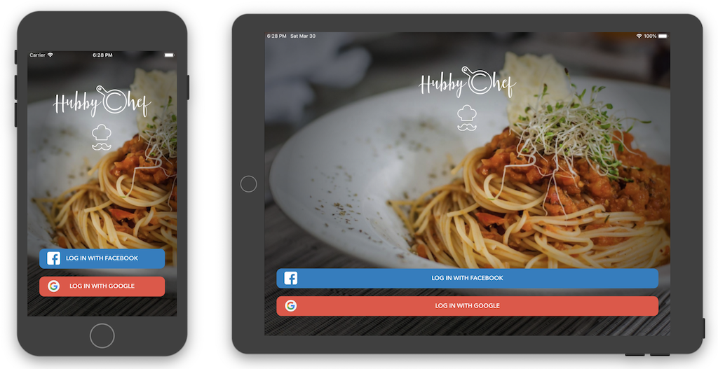
This is the main template of the screen:
<FlexboxLayout alignItems="stretch" flexDirection="column">
  <Image marginTop="46" width="250" height="183" alignSelf="center" src="res://loginlogo"/>
  <Label flexGrow="1"/>
  <Button class="social-login fb" text="Log in with Facebook"/>
  <Button class="social-login google" text="Log in with Google"/>
</FlexboxLayout>
It looks fine on a phone, but not quite as much in a tablet, especially in landscape mode. The problem here is that the buttons are too wide. To fix it, we can add css style to limit the button width, and scope it to .tablet so it only applies to tablets, like so:
.tablet button.social-login {
  align-self: center;
  width: 400;
}
We aligned the buttons to the center of the (FlexLayout)[https://docs.nativescript.org/ui/layouts/layout-containers#flexboxlayout], and gave them a fixed width of 400dpi. Much better now:
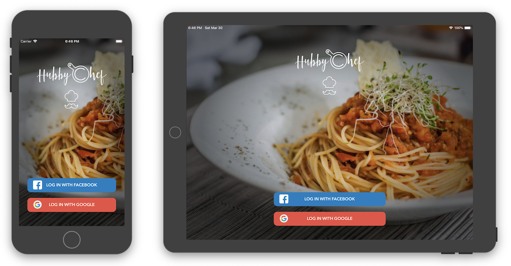
This is a simple example, but one that shows that opens lots of possibilities. If you are used to CSS media queries, this technique is for you. All thanks to the nativescript-platform-css plugin!
The almighty <GridLayout> may also give us a hand making our app responsive. That is because this layout responds pretty well when we change its structure in runtime. We can use this to our advantage and rearrange the layout according to the width of the screen.
Look at the recipe screen, implemented with <GridLayout> in our fake recipe app:
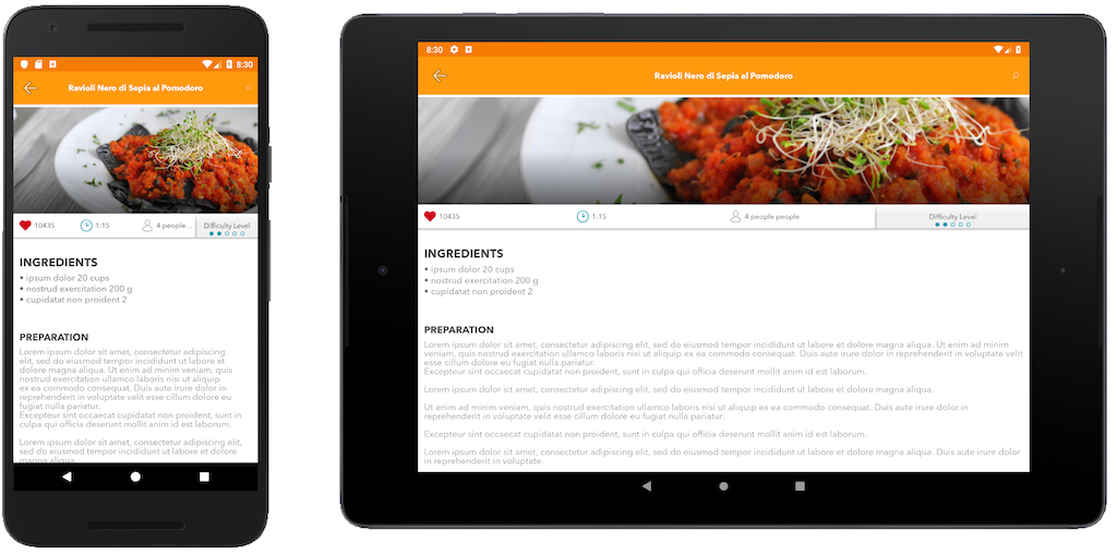
On a landscape tablet, the text stretches too much horizontally. We could make better use of the available screen width by putting the ingredients side by side with the preparation instructions. The difference in the "landscape grid" from the "portrait grid" is that we have one less row as the Ingredients stay on the same row as the Instructions. Let's see how to do that.
To start, we made the <GridLayout>'s rows reactive, as well as the row, col and colSpan for the grid cells that change their position. The template ended up like this:
<GridLayout
  columns="*, *, *, *"
  :rows="gridLayout.rows"
  ref="layout"
  @layoutChanged="updateLayout"
  >

(...)

  <StackLayout
    :row="gridLayout.ingredients.row"
    :colSpan="gridLayout.ingredients.colSpan"
    textWrap="true"
    id="ingredientsText"
    ref="ingredientsText"
  >
    <!-- Ingredients text added here -->
  </StackLayout>

  <StackLayout
    :row="gridLayout.instructions.row"
    :col="gridLayout.instructions.col"
    colSpan="4"
    textWrap="true"
    id="instructionsText"
    ref="instructionsText"
  >
    <!-- Recipe text added here -->
  </StackLayout>

  (...)

</GridLayout>

(...)
We added a gridLayout object to the component's data to keep these layout changes organized:
data() {
  return {
    gridLayout: {
      rows: "40, auto, auto, 40, auto",
      ingredients: {
        row: 1,
        colSpan: 4
      },
      instructions: {
        row: 2,
        col: 0
      }
    },

(...)
This gridLayout data is initialized by default in the portrait mode. Then, we created a method updateLayout() to change this object's values to the landscape mode, if there is enough space. Take a look:
updateLayout() {
  const width = utils.layout.toDeviceIndependentPixels(
    this.$refs.layout.nativeView.getMeasuredWidth()
  );

  if (width < 1000) {
    this.gridLayout = {
      rows: "40, auto, auto, 40, auto",
      ingredients: {
        row: 1,
        colSpan: 4
      },
      instructions: {
        row: 2,
        col: 0
      }
    };
  } else {
    this.gridLayout = {
      rows: "40, auto, 40, auto",
      ingredients: {
        row: 1,
        colSpan: 1
      },
      instructions: {
        row: 1,
        col: 1
      }
    };
  }
}
In this function, we start by grabbing the width of the <GridLayout> with getMeasuredWidth(). This value may come in pixels, so we have to convert it to device independent pixels (DIPs) with the function toDeviceIndependentPixels().
Warning! The function
utils.layout.toDeviceIndependentPixels()comes from the NativeScript utils package, so you need to import it with:import * as utils from "utils/utils";
Then, if the width of the screen is greater than 1000 DPIs, we rearrange the grid layout by changing the gridLayout data object.
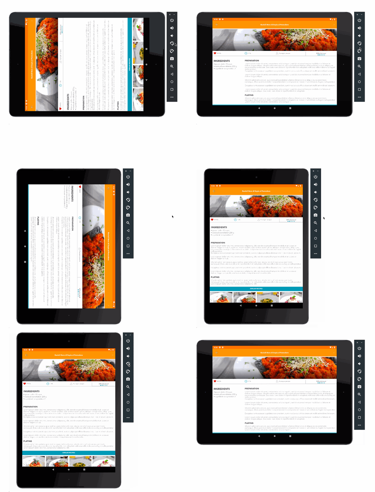
Another important detail is that we attached the method updateLayout() to the @layoutChanged event. This event triggers whenever the <GridLayout> layout is re-calculated, which happens when the layout is rendered for the first time, and also when the screen orientation changes. That's right, the layout adjusts to screen rotations!
We picked 1000 DPIs as the breaking point because that is about where the landscape tablets start. Devices vary a lot, but here are approximate values that may help you decide breakpoints:
This technique seems complicated but certainly beats having to re-implement the layout for tablets. Also, the <GridLayout> performance is spotless: no perceivable "jumpy layout", screen flashing or lag. See for yourself:
The <RadListView> is a feature-packed component that provides lots of improvements over the <ListView>. One of these features is the ability to use a grid layout instead of a stacked layout. And how will feature this help us make our app responsive? Well, according to the documentation, we can easily define the number of columns using the parameter gridSpanCount.
This is how the responsive grid list view looks in our app:
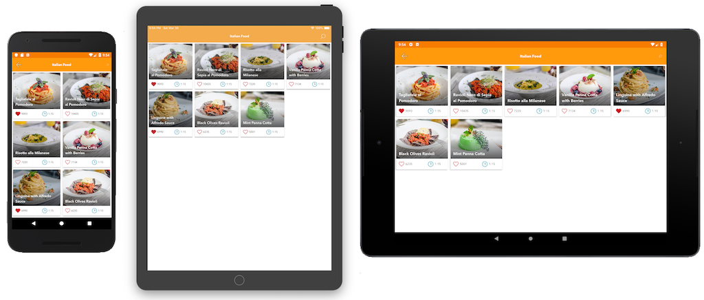
Notice that on a phone the grid has two columns, on a portrait tablet it has four columns, and on a landscape tablet it has five columns. This is the code of the component:
<template>
  <RadListView
    for="recipe in recipes"
    layout="grid"
    itemHeight="200"
    :gridSpanCount="gridColumns"
    ref="layout"
    @layoutChanged="updateLayout">
    <v-template>
      <RecipeCard :recipe="recipe"/>
    </v-template>
  </RadListView>
</template>

<script>
import * as utils from "utils/utils";
import RecipeCard from "../components/RecipeCard";

export default {
  props: ["recipes"],
  components: { RecipeCard },
  data() {
    return {
      gridColumns: 4
    };
  },
  methods: {
    updateLayout() {
      const width = utils.layout.toDeviceIndependentPixels(
        this.$refs.layout.nativeView.getMeasuredWidth()
      );

      this.gridColumns = parseInt(width / 180);
    }
  }
};
</script>
The "responsiveness magic" happens in the gridSpanCount attribute. We made the number of columns reactive to the variable gridColumns. Then, we changed the gridColumns variable in the updateLayout method. We used the method from the previous section to retrieve the available width. This also means that the layout adjusts automatically on screen rotations. We divided the total width by 180 to allow the cards' width to vary between about 180 and 250, so they will look roughly squared in every device.
In this article, we implemented "responsiveness" in three different ways. These techniques will allow you to make the app look good on wider screens (such as tablets) using a minimal amount of code.
The first technique used CSS, which makes it appealing to experienced web developers. The other methods used (and abused) NativeScript's reactivity system, showing how malleable this framework is. With some creativity, we can do anything!
There are probably a thousand different ways to make an app responsive. Have you used other methods? I would love to hear about them in the comments!