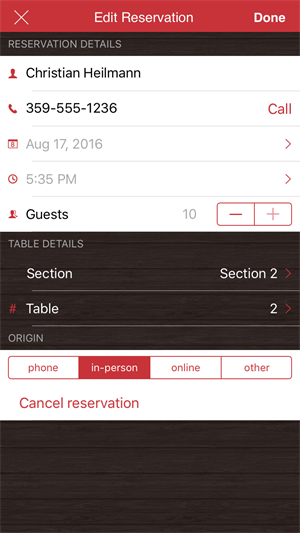
About a month ago, we released a Beta of DataForm for NativeScript. After adding some more features, and addressing the issues we found, we are happy to announce the official DataForm for NativeScript, which is a part of UI for NativeScript Pro.

In the article announcing the beta version, I showed you how to quickly set up a DataForm, add a custom editor, set grouping and add some styling. Now I will focus on the features we did not cover with code implementation back then.
Validation and feedback
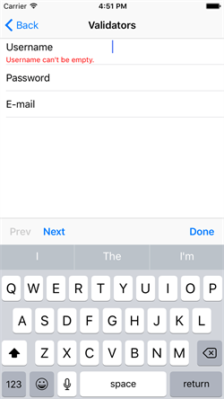
A predefined set a validation rules allow you to quickly set certain requirements on the entered data. Here’s how easily we can set two validation rules (NonEmptyValidator and MaximumLengthValidator) for one field, where the first rules does not allow empty value and the second rules restricts the data to 12 characters at most:

The other validation rules that are supported are:
As for the validation error text, as you can see, this can be easily set in the xml using the errorMessage attribute.
The validation rules above can be triggered on a DataForm level
<df:RadDataForm id="myDataForm" source="{{ user }}" validationMode="Immediate">
using one of the following validationMode values:
Commit modes
The values entered in the DataForm can be submitted to the underlying data object on three different occasions, using the commitMode property of the DataForm:
dataform.commitMode = dataFormModule.CommitMode.Immediate;
The available modes are:
Accessing the editor
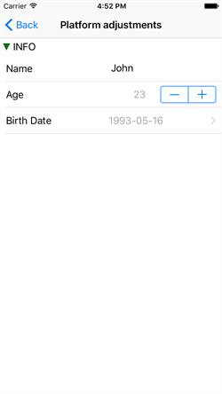
A few useful editor APIs made their way to the first official version of the DataForm component. We understand that the default look and feel of the editors may not always suite your app look and feel or regional settings. Therefore, we exposed an event editorUpdate which is called as the editor appears. Here’s how to change the formatting of the datetime editor value and to set some spacing between the updown buttons and the displayed value:

In order to start using the DataForm today, get a free Trial of UI for NativeScript Pro from NPM.
What’s next for the DataForm
Now that the DataForm is official, the next steps is to enable it to Angular 2. You may expect that to happen in one of our next versions.
A release compatible with the official Angular 2 and NativeScript 2.3
Just to mention it, and you should not be surprised, that we are compatible with the official Angular 2 which came out just a day before our release. So, you can expect our Angular 2 enabled components to work flawlessly with the official Angular 2. And of course, our components are built for the latest NativeScript 2.3
The survey
We created a survey to help us understand how we can make the NativeScript even better for you and your applications. Please take a few moments, fill out the survey and let us know what you think.