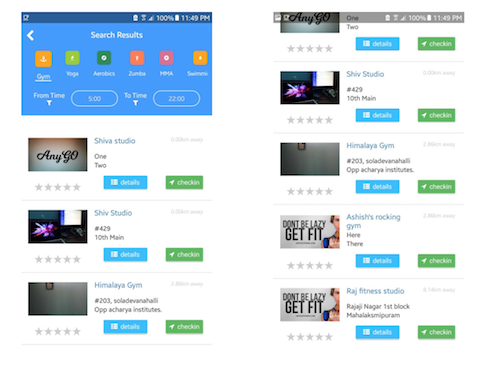
When you take a look at apps which follow the Material Design specifications, collapsing a toolbar is one of the most common behaviors you’ll see. In this pattern, when the user scrolls down the page, the ActionBar collapses and when the user scrolls up the page, the ActionBar comes back.
Note: the code I’ll be sharing here will be for NativeScript Core with JavaScript.
If you are trying to make this in NativeScript, it is fairly straightforward if the page just contains some layout surrounded by a ScrollView, because then you’d have the scroll event to listen to, and make changes to the Action Bar accordingly, like setting page.actionBarHidden = true when the user scrolls down.
But in the case where you have a ListView in your page, things are not so straightforward after all. Which is why I’m going to share this technique I use to make a collapsible ActionBar possible in a page that has a ListView. So by the end of this post, you’ll know how to make a page that looks like the image on the left, collapsing the ActionBar so that it looks like the image on right as the user scrolls down.

To start with, I'm sorry to tell you that it is not easy to create this effect using the ActionBar available out of the box in NativeScript. So we’ll be building our custom ActionBar.
Step 1: Inside the Page element, create a GridLayout. This will be the key element that makes this effect possible. Also, don’t forget to set actionBarHidden=”true” on the Page element to hide the default action bar of NativeScript. So the basic layout should look something like this:
<Page class="page" loaded="loaded" unloaded="unloaded" navigatedTo="onNavigatedTo"
xmlns="http://schemas.nativescript.org/tns.xsd"
actionBarHidden="true">
<GridLayout rows="auto,*" columns="*" backgroundColor="transparent">
</GridLayout>
</Page>
Step 2: Next, we place any loading indicator or placeholder text and the ListView and the custom action bar all on the same row and in the same column, in that order. This is how the content of the GridLayout should look:
<ListView rowSpan="2" row="0" col="0"
itemTemplateSelector="$index === 0 ? 'first' : 'rest'"
visibility="{{ loaded ? 'visible' : 'collapsed' }}"
items="{{ listItems }}" id="searchResults">
<ListView.itemTemplates>
<template key="first">
<GridLayout paddingTop="250">
</GridLayout>
</template>
<template key="rest">
<GridLayout>
</GridLayout>
</template>
</ListView.itemTemplates>
</ListView>
<ActivityIndicator row="0" col="0" marginTop="150" width="50" height="50" busy="true" visibility="{{ !loaded ? 'visible' : 'collapsed' }}" />
<Label row="0" col="0" class="text-muted h2 text-center" textWrap="true" marginTop="350" text="{{ typeEmptyMsg }}" visibility="{{ isTypeEmpty && loaded ? 'visible' : 'collapsed' }}" />
<StackLayout row="0" col="0" id="container">
<GridLayout id="actionBar" rows="20, 40, 80, auto" columns="75,*,75" class="action-bar p-10">
<Label paddingTop="10" tap="onNavBtnTap" text="" fontSize="25" fontWeight="100"
color="white" class="fa" row="1" col="0" />
<Label text="Search Results" color="white"
class="action-bar-title text-center" row="1" col="1"></Label>
</GridLayout>
</StackLayout>
Step 3: Now that we’ve got out markup ready, let me explain some crucial bits of it.
`itemTemplateSelector="$index === 0 ? 'first' : 'rest'" This snippet allows us to set a special key which we will use to differentiate the first item of the ListView with the rest of it.
Note that we are using <listview.itemtemplates> instead of a regular itemTemplate. This allows us to specify multiple templates which will be rendered if a certain condition is met. In our case, if the list item is the first item, then we want to add a padding equal to the height of our custom action bar, so that when the ActionBar is visible, the first item of the list doesn’t get hidden behind the custom ActionBar.
We’re surrounding our custom ActionBar with a StackLayout so that we prevent the GridLayout from taking the entire screen space when having a background color.
That's about it for the markup; now let’s get to the fun part, where the magic happens.
Step 4: Import the gestures module in your code behind file:
const gestures = require("ui/gestures");
const app = require("application");
Also, create these two variables outside all functions: let headerCollapsed = false; let lastDelY = 0;
Once you have that in the loaded method of the code behind file, you get a reference to our listView element (“searchResults” in this case) and the “container” element. Attach a 'pan' gesture listener to the listView:
exports.loaded = function(args) {
page = args.object;
searchResults = page.getViewById("searchResults");
container = page.getViewById("container");
searchResults.on(gestures.GestureTypes.pan, function(args) {
if (Math.round(args.deltaY) < -100 && !headerCollapsed) {
container.animate({
translate: { x: 0, y: -230 },
duration: 500
});
headerCollapsed = true;
hideStatusBar();
return;
}
if (Math.round(args.deltaY > 100) && headerCollapsed) {
container.animate({
translate: { x: 0, y: 0 },
duration: 500
});
headerCollapsed = false;
showStatusBar();
return;
}
if (lastDelY !== Math.round(args.deltaY)) {
let tmp = container.translateY;
if (lastDelY < 0 && lastDelY < args.deltaY) {
args.deltaY *= -1;
}
if (lastDelY > 0 && lastDelY > args.deltaY) {
args.deltaY *= -1;
}
tmp += args.deltaY * 0.05;
if (tmp < -230) {
tmp = -230;
hideStatusBar();
} else if (tmp > 0) {
tmp = 0;
showStatusBar();
}
lastDelY = Math.round(args.deltaY);
container.translateY = tmp;
}
});
};
function showStatusBar() {
if (app.android) {
const activity = app.android.startActivity;
const win = activity.getWindow();
win.clearFlags(
android.view.WindowManager.LayoutParams.FLAG_FULLSCREEN
);
}
}
function hideStatusBar() {
if (app.android) {
const activity = app.android.startActivity;
const win = activity.getWindow();
win.addFlags(
android.view.WindowManager.LayoutParams.FLAG_FULLSCREEN
);
}
}
Let me explain what I’m trying to do in the pan event listener. First, when the pan event fires, we get args.deltaX and args.deltaY, indicating the change in the respective direction. We want to animate the action bar only if there are more than 5 items (as per your liking) in the list view.
The first “if” block handles the case where user simply swipes down, i.e., there’s a large change of deltaY, less than -100 (value chosen after experimentation), and the header is not already collapsed. In this case, we simply want to animate the header out of the view.
Similarly, the second “if” block handles the case where the user simply swipes up. We want to animate the header back into the view.
Next we have another “if” block where I’m allowing for that smooth sliding up of the ActionBar. I first check if the last delta Y that I stored is not the same as the current one. Because when user is slowly panning, the delta changes are in decimals. I don’t want to move the Action Bar for such minute changes, hence the rounding.
In the first line here, I’m saving the translateY property of the container in a temporary variable. The first “if” block handles the case where user slides his/her finger upwards and immediately changes the direction. The second “if” block handles the case where the user slides his/her finger downwards and immediately changes the direction. Basically, by multiplying the delta with -1, I’m changing the direction in which the ActionBar moves.
Now we simply add the deltaY * 0.05 (a number chosen after experimenting), to our temporary variable. We next check if the value of the temporary variable exceeds the amount of pixels you have to translate the container to make it go out of the view. If it does, then we set it back to the max value. If the temporary variable becomes greater than 0, we set it back to 0, because we don’t want to translate the ActionBar downwards anymore.
Now we save the rounded value of the current deltaY as our last deltaY. Finally we set the container’s translate Y property to the temporary variable we created. Last but not least, don’t forget to remove the event listener in the unloaded event to prevent any unexpected behavior.
exports.unloaded = function(args) {
   searchResults.off(gestures.GestureTypes.pan);
};
That’s about it. With that I was able to achieve something that looks like
this I hope this post helped you to make a collapsible ActionBar in your app. Happy NativeScripting!
Note: This technique was tested only on android. So the experimental values suggested in the pan event handler could be different on iOS.
