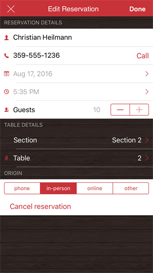
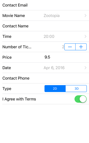
A common mobile application use case is to collect data from users. For example, when a user is presented with a registration screen, there are a number of different properties (and data formats) indicated to collect the necessary information like name (string), age (number), birth date (date-time), and gender (a set of predefined strings). Another case would be the purchase of ticket(s) for a movie where you have to select the movie, set number of tickets, date, etc.
While each form is different, the overall concept of presenting properties according to a specific data type, ensuring validation rules are respected, and saving the information follows a consistent and regular form. Wouldn’t you like to have an easy to use component that provides the end-user with the ability to enter all this data in a user-friendly and convenient way? Introducing the DataForm for NativeScript!

The major benefits of using the DataForm compared to creating your own forms is the speed of implementation (it is literally a matter of simple configuration to display an entry form), much more robust and easy to support solution (due to the drastically smaller code size) and last, but not least - the DataForm component automatically renders the input fields according to the native OS design specification. The DataForm can automatically generate the necessary input fields based on the input Data Model. You are also given the opportunity to tweak the default editors and styling if you want. Please read below for more details. You will forget about building forms manually from now on :).
First, let’s see how quickly you can set up a simple DataForm.
Getting Started
Imagine you have the following view model:
export class PersonViewModel {
private _person: Person;
constructor() {
}
get person() {
if (!this._person) {
this._person = new Person("John", 23, "john@company.com", "New York", "5th Avenue", 11, "Male");
}
return this._person;
}
}
export class Person {
public name: string;
public age: number;
public email: string;
public city: string;
public street: string;
public streetNumber: number;
public gender: string;
constructor(name, age, email, city, street, streetNumber, gender) {
this.name = name;
this.age = age;
this.email = email;
this.city = city;
this.street = street;
this.streetNumber = streetNumber;
this.gender = gender;
}
}
In our page code-behind set the view model like this:
import viewModel = require("./../view-models/person-model");
export function onPageLoaded(args) {
var page = args.object;
page.bindingContext = new viewModel.PersonViewModel();
}
Then, simply set the data source of the DataForm to the data view model. This will create a list of property editors, where each editor corresponds to the underlying data type:
<df:RadDataForm id="myDataForm" source="{{ person }}" />
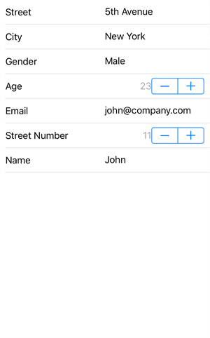
And here is the result from this single line of xml:

DataForm is a very capable component. Let’s take a look at some other features, that will also add up to this example.
A handful of predefined editors. Ability to support custom editors.
The DataForm exposes a great number of ready-made editors for every type you can think of, for example:

If the built-in editors are not enough, you can create your own custom editor or select from a range of available editors and instruct DataForm to use it.
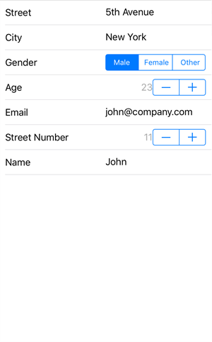
For instance, in the Getting Started part, we have a Gender property of type string. It would not be that convenient if we have to actually make the end-user type the gender using the software keyboard. Therefore, with this simple xml we can tell that the Gender property should be edited by a segmented editor, giving three predefined values:
<df:RadDataForm.properties>
<df:EntityProperty name="gender" displayName="Gender" valuesProvider="Male, Female, Other">
<df:EntityProperty.editor>
<df:PropertyEditor type="SegmentedEditor" />
</df:EntityProperty.editor>
</df:EntityProperty>
</df:RadDataForm.properties>

Validators and feedback message
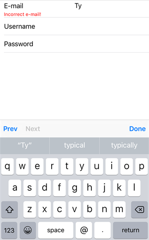
The DataForm comes with predefined set of validations for you to use. You can validate if the field is empty, if the data is below/above certain length, if it complies to the e-mail standard and so on. If the validation does not pass, a custom informative message is displayed.

Commit modes
The commit mode determines when the value you have just entered is processed to the underlying data object. The options are:
- As you type
- On editor lost focus
- Manual commit (for example, on a button click)
These event triggers help you ensure your data is committed to the underlying data object in accordance with your application business logic and requirements.
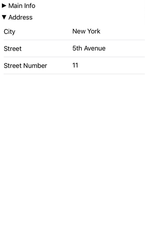
Collapsible groups
In the Getting Started part we created a form to edit the various properties of a person. But wouldn’t this be more neat and tidy if we group the properties according to a certain criteria? The DataForm supports groups that we can easily enable:
<df:PropertyGroup collapsible="true" name="Main Info" hidden="false">
<df:PropertyGroup.properties>
<df:EntityProperty name="name">
<df:EntityProperty.editor>
<df:PropertyEditor type="Text" />
</df:EntityProperty.editor>
</df:EntityProperty>
<df:EntityProperty name="age" >
<df:EntityProperty.editor>
<df:PropertyEditor type="Stepper"/>
</df:EntityProperty.editor>
</df:EntityProperty>
<df:EntityProperty name="email" >
<df:EntityProperty.editor>
<df:PropertyEditor type="Email" />
</df:EntityProperty.editor>
</df:EntityProperty>
<df:EntityProperty name="gender" displayName="Gender" index="3" valuesProvider="Male, Female, Other">
<df:EntityProperty.editor>
<df:PropertyEditor type="SegmentedEditor" />
</df:EntityProperty.editor>
</df:EntityProperty>
</df:PropertyGroup.properties>
</df:PropertyGroup>
Note that when defining groups, we should also define which properties/editors should reside in these groups.
The result from this will be:

The fact that the groups are collapsible comes in-handy for long lists of properties, where you may want to focus on filling in the data in just one group without scrolling up/down the entire list of properties.
Styling
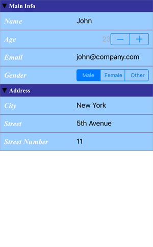
The DataForm we came up with would do the job for the end-user, but it still looks somehow boring. In order to amend that, the DataForm provides a wide range of styling options for you to tweak. Here it is how we can style a group and an editor, and what the result at the end will be:
<df:PropertyGroup collapsible="true" name="Address" hidden="false" >
<df:PropertyGroup.titleStyle>
<df:GroupTitleStyle
fillColor="#333399"
labelTextSize="15"
ios:labelFontName="Times New Roman"
android:labelFontName="sans-serif"
labelFontStyle="Bold"
labelTextColor="White"/>
</df:PropertyGroup.titleStyle>
</df:PropertyGroup>
<df:EntityProperty name="city" >
<df:EntityProperty.editor>
<df:PropertyEditor type="Text" >
<df:PropertyEditor.style>
<df:PropertyEditorStyle
strokeColor="#8585ad"
strokeWidth="1"
fillColor="#99ccff"
labelHidden="false"
labelTextSize="18"
ios:labelFontName="Times New Roman"
android:labelFontName="sans-serif-light"
labelFontStyle="BoldItalic"
labelTextColor="#FFFFFF"/>
</df:PropertyEditor.style>
</df:PropertyEditor>
</df:EntityProperty.editor>
</df:EntityProperty>
And.. Voila!

Examples and Documentation
Running examples featuring the current DataForm capabilities can be found in our
UI for NativeScript Samples repo.
You can also check the
UI for NativeScript Documentation for DataForm to understand more about the component.
Feedback
The DataForm control for NativeScript is still in Beta. We encourage you to give it a try, so that we can make it even better for you. Share your feedback in our
UI for NativeScript Feedback repo as well as via our
support ticketing system. Note that in order to use the latter, you should have an active
UI for NativeScript Trial downloaded from telerik.com or an active UI for NativeScript purchase.
What’s Next?
Expect the official version in mid-September with our next release. In a future release you can also expect the Angular 2 support for the DataForm. Stay tuned!
