In NativeScript 6 we introduced two new tab navigation components to the core modules suite. They are dubbed BottomNavigation and Tabs and are meant to be new and better alternatives to the existing TabView component. Now, with version 6.1 they are finally out of beta.
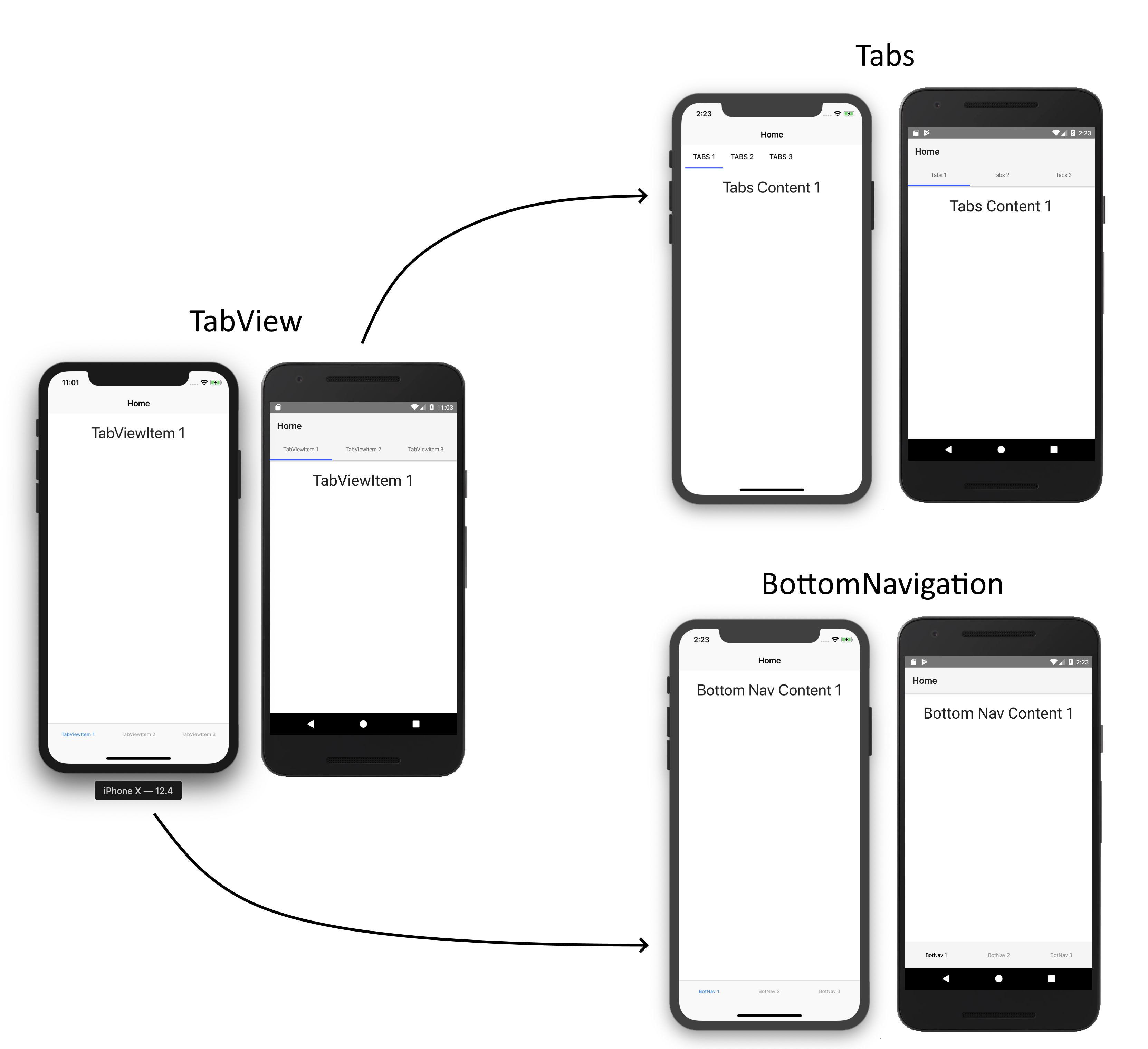
Some time ago we identified the TabView as one of our most problematic components in terms of reported issues. Given the component’s importance to the overall app navigation we wanted to fix this. The issues ranged from bugs and difficulties in use to unsupported scenarios and limitations. Picking these one-by-one didn’t work out very well and we took a more holistic approach to figure out what was wrong. Ultimately, we decided on a complete redesign that included a new approach to markup, styling, and customization. We also took inspiration from Material Design to separate the components by function and thus, we have two components in place of the TabView: BottomNavigation and Tabs.
These two new ones are so much better you should forget about the TabView entirely. Let’s see why.
Tip: Be sure to check out the custom tab bar at the end for maximum coolness overload.
Firstly, I must explain why we decided to go for two separate components. The BottomNavigation and Tabs components are separated by function. As I mentioned, we took heavy inspiration from Material Design, so you can check the respective articles about BottomNavigation and Tabs usage for some explanation and examples in terms of design. Here is a table that displays the behavioural differences between the two:
| Tabs | BottomNavigation | |
| Semantic | Mid Level Navigation | High Level Navigation |
| Usage | Unlimited Tabs with Common Function | 3 to 5 Tabs with Different Function |
| Transitions | Slide Transition | No Transition |
| Gestures | Swipe Gesture | No Gesture |
| Preloading | At least 1 to the sides | No preloading |
| Position | Top/Bottom | Bottom |
As you can see, these are two different components with different behaviour and both have their use cases. Use the BottomNavigation for high level navigation where the separate tabs don’t have shared context. Use the Tabs component when you want to create sort of a pager to browse between items that have the same context. One of the problems of the TabView component was that it tried to combine these two sets of behaviours in a weird way - for Android it effectively had the Tabs behaviour, while for iOS it did the BottomNavigation one. Technically, it provided navigation with tabs, but in reality it was hard to use and figure out and also, it was hard to maintain.
Another benefit from having two components is that you can now combine them - have Tabs on the top with BottomNavigation on the bottom. This was previously impossible or very hard to achieve.
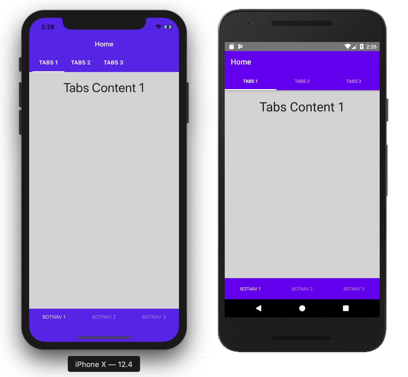
See a Playground example with Tabs and BottomNavigation Combination
As you can see there is some styling here. Let’s see how this is done now.
The new components also come with new markup. It turned out markup is pretty important for CSS styling. In order to get the most of it, we had to create component representations for each visible unit that you would want to style. There are three new child components for BottomNavigation and Tabs.
TabStrip - represents the whole set of tabs. Can contain TabStripItems.
TabStripItem - represents a single tab. Can contain two child components - Image and Label - which represent the title and icon of the tab.
TabContentItem - represents the content section of each tab that is navigated to when the respective tab is selected. Can contain any layout component or a new tab component.
Here is an example of the new markup with the BottomNavigation component. It’s identical to the Tabs one.
<BottomNavigation>
    <TabStrip>
        <TabStripItem>
            <Label text="Title"></Label>
            <Image src="~/icon.png"></Image>
        </TabStripItem>
        <TabStripItem>
            <Label text="Title"></Label>
            <Image src="~/icon.png"></Image>
        </TabStripItem>
    </TabStrip>

    <TabContentItem>
        <GridLayout>
            <Label text="Content"></Label>
        </GridLayout>
    </TabContentItem>

    <TabContentItem>
        <GridLayout>
            <Label text="Content"></Label>
        </GridLayout>
    </TabContentItem>
</BottomNavigation>
An added benefit of this markup declaration is that it’s now the same across frameworks. There is no need for directives and such. Of course, binding varies based on framework.
This new markup is perfectly tailored for styling with CSS and we can now forget about the weird properties like selected-tab-text-color and use the regular CSS selectors and pseudo selectors. You can now style each tab individually.
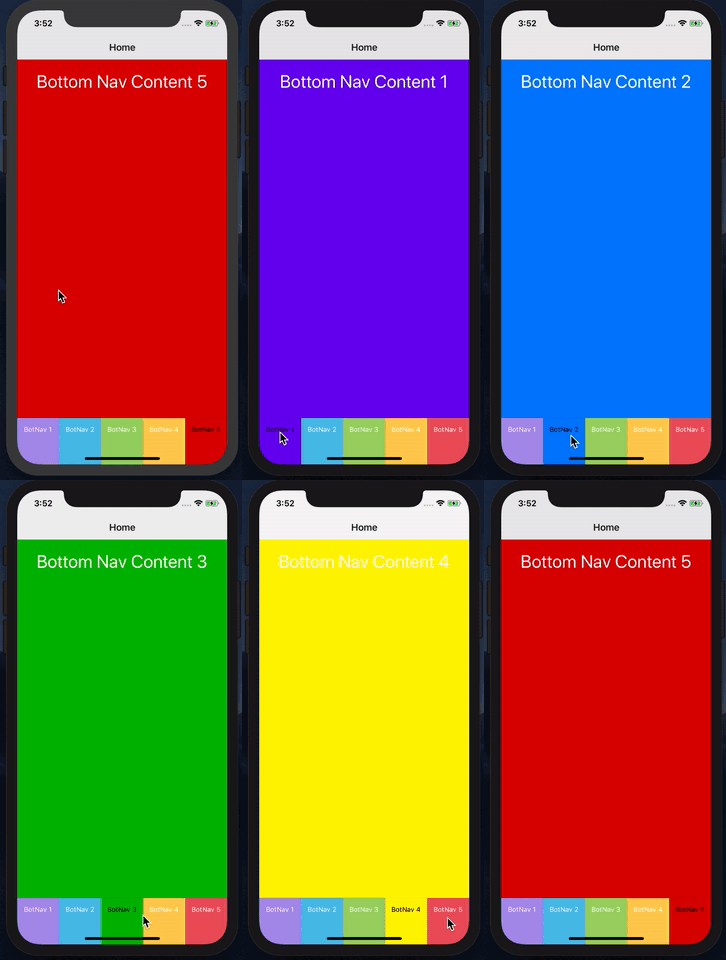
View a Playground example with Tabs Styling
Admittedly, it’s not the best design decision to have tabs with different contrasting colors, but I’ll leave the design to you. The important thing is, it’s now possible to achieve more.
As you can see the TabStripItem components also support the :active pseudo selector that allows you to style them in their selected state.
Currently, there are only four supported CSS properties to bring feature parity with the TabView component.
colorbackground-colorfont (together with the individual properties)text-transform!!iOS Limitation!! You can’t style individual
TabStripItemcomponents on the iOSTabscomponent. You can style them on theTabStripcomponent together.
Producing icon resources was never the fun part of app development. The fact that the TabStripItem now has its title and icon separated as Image and Label components in the markup meant that we could now enable font icon support. You can even style its color which means active state too. One might say that this feature comes just at the right time as with dark mode just around the corner, you had to produce even more icon resources. Here is a quick example:
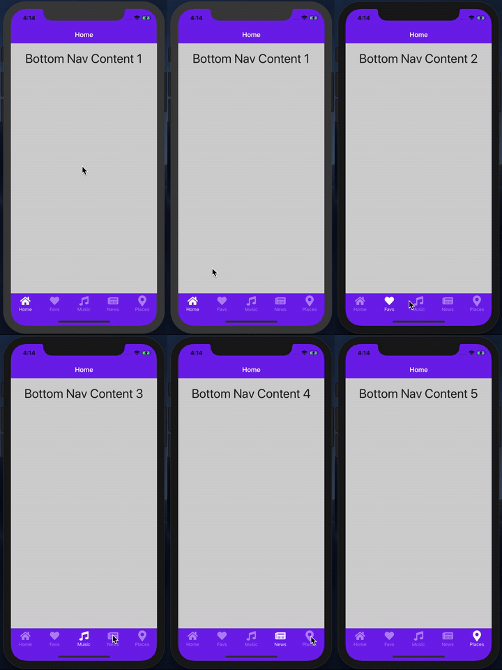
View a Playground example with Tabs Font Icons
One of the unfortunate pitfalls of the TabView was that you couldn’t easily implement the tab re-selected pattern. That is, if you do some actions in a certain tab content and you select the tab again, you would want to refresh the tab content. We thought about this too and to let you handle such scenarios we exposed new individual events.
TabStrip exposes an itemTap event which fires when you tap any tab.TabStripItem exposes a tap event which fires when you tap only that peculiar tab.This means we can now do the pattern easily.
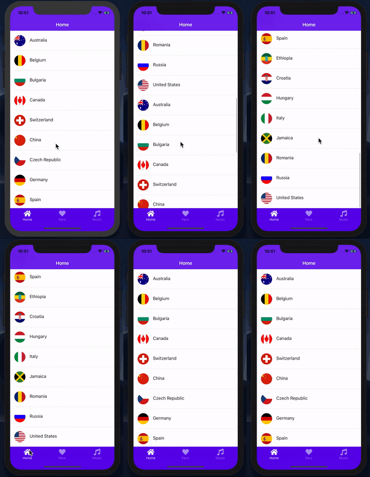
View a Playground example with Tab Reselect Refresh
The above things are all fine and already huge improvements on the TabView component, but we wanted to provide you the freedom to do anything. NativeScript’s layout system together with CSS and animations let you create any kind of tab bar you want. And if you can create it, there is no reason for us to not let you use it in these tab navigation components.
To use a custom tab bar simply omit the TabStrip component from the tab navigation component. Now the behaviour is the same, but there is no tab bar and you can use the regular NativeScript composition to add your own. You can use the selectedIndex API of the tab navigation components to control them with your custom tab bar.
There is a very cool cradle tab bar implementation, kudos to @Williamjuan27, that I always wanted to try out with the new components. So here it goes.
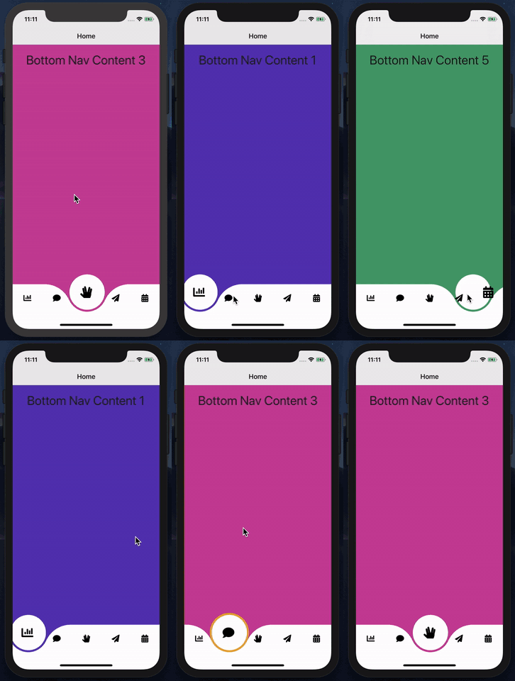
View a Playground example of a Custom Cradle Tab Bar
Also worth mentioning is that there are already some tab bar implementations provided as plugins. You can find them in the NativeScript Marketplace!
There are a couple of things that we wanted to do, but ultimately didn’t have the time and resources in this release.
TabView component and the new BottomNavigation and Tabs don’t really support binding. Dynamically setting tabs and contents has to go through re-creating the components which doesn’t provide good UX.BottomNavigationBar and TabsBar - We wanted to provide you the native tab bar implementation so you can implement your own custom tab navigation and still use the tab strips.We hope we can add these in a future release.
The BottomNavigation and Tabs components are better versions of the TabView component in every way. If you have the old one in your apps don’t hesitate to substitute it for the suitable new alternative. Better yet, create your own custom tab bar and get your app to the next level.
Ultimately, have fun and don’t forget to share the awesome apps you create!